
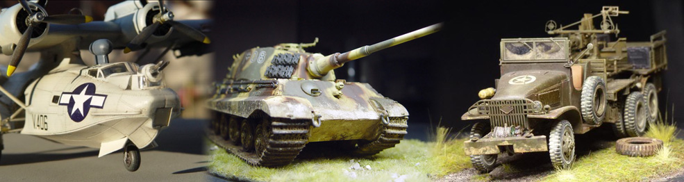
Often i see great models that aren't enough valued by the photos, because of too dark, too light and with wrong colors. But it is easy to fix that...
I will not write here about what you can do when shooting the images (there are tons of tutorials about photography), but what you can do to fix a not-perfect image.
There are 2 main problems that you can fix:
Wrong exposure
The digital camera have very good sensors for the exposure, but regardless to what the various brands say, they aren't smart. With this i mean that they are not intelligent: they don't understand what inside your composition is important and what isn't.
So it can happen that the camera set the exposure not for your model, but for the background, or for the table where your model is displayed, or for the light of the lamp entering from one of the corners, etc, etc.
The result? The model inside your photo is too dark or too light.
Wrong colors
Human eye is trained to compensate for "wrong" colors. If you look something under a neon light, your eye will "delete" its greenish light, and you will see it almost as normal.
I don't want to write here about a very complex field, the one of "color temperature of the light", but you must know that each source of light has a different tone, or "color temperature". This happens with the sun too... in the morning the colors appear more "cold" or "white", and in the late afternoon they appear more "reddish".
The sensors of a digital camera try to compensate for this problem, usually with good result, but still not perfect. If for example your model is on a green cutboard, there are good chances that the camera will be deceived but that big greenish area, and the color of the model will be not right. And also the source light that you use can deceive the camera... Remind, what you see as "white", perhaps is not...
Fixing the problems with image editing software
To fix a wrong or also just not perfect image, there is an easy solution: using an image editing software. "photoshop" style.
Wait, wait, wait... i know what you are thinking: Photoshop is a professional software, it is expensive, it is hard to learn, etc. etc.
And indeed i wrote "Photoshop STYLE", not Photoshop.
So, keep calm and continue to read.
If you are already using Photoshop you don't need these note, that are for people that never used this kind of software.
Personally I use Photoshop to correct my photos, but there are around many FREE ALTERNATIVES, very easy to use, and we will focus on them.
You even don't have to download and install any software, because you can use an online editing software: all what you need is an internet connections and a browser like Firefox, Chrome etc (and if you are reading these notes, you have them :) )
Just do a Google search for "online image editing tools", as i did before to write this article. You will find lot of nice tools.
For this article i picked up one called iPiccy http://ipiccy.com/ but the concepts apply to any of them, the only things that can change is the name of the various commands.
But with this one you can make a test even without to register, as i did (and of course it is free!)
For this small test i used a photo that i took many years ago of a model of a Zero. It was taken outside, in the late afternoon. It is not completely wrong, but as you can see it is a little too dark, and the colors are too reddish.
First we need to upload the photo

As a first thing, let's correct the exposure... we want it a little less dark.
As you can see, on the left toolbar there is button called EXPOSURE. Click on it
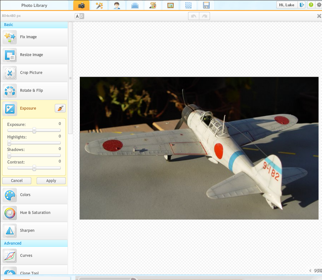
There are 4 parameters: Exposure, Highlights, Shadow, Contrast. You can play (and you should!!) with each of them, but to keep the things easy i will use only the first one, EXPOSURE, dragging its slider a little to the right (the value changes from 0 to 35).
OPTIONAL
The image is still a little too much contrasted. so we can also fix that with the slider Contrast, dragging it a little to the left
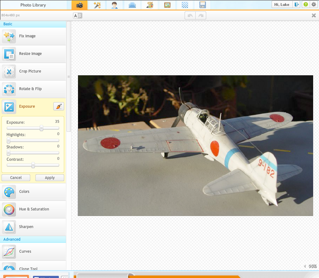
When finished click to the botton APPLY
Now it is time to fix the reddish tone of the image. We will use the button COLORS, again in the left toolbar. When you click on it you see buttons (Auto colors, Neutral Picker) and 3 sliders (Saturation, Temperature, Fade).
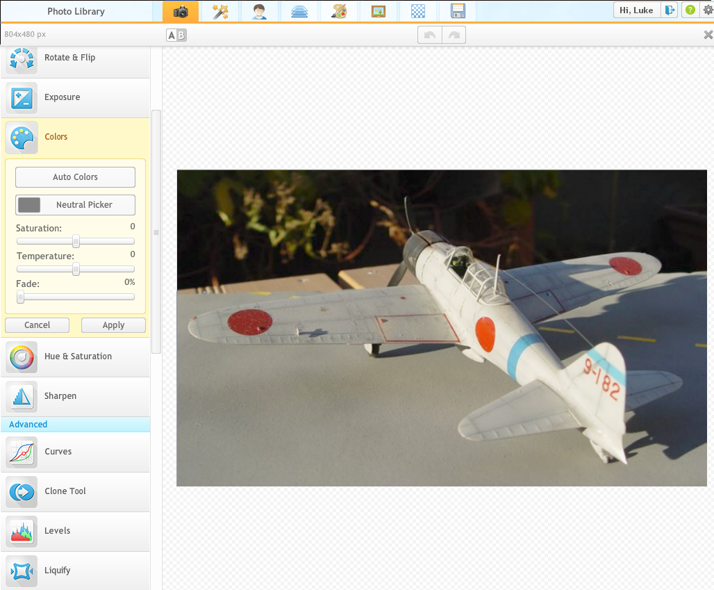
Again, spend 5 minutes playing with them to increase the range of chances that you have, but again, i will keep it simple, and use ONLY ONE, the slider Temperature, dragging it a little to the left and changing the value from zero to -5.

That's all ! Our image now looks better. Of course if i played with the other options, i could obtain a much more better results, but this short tutorial was for the people wanting a quick, easy solution.
But if you spend 5 minutes, just 5 minutes, playing with the other options, you will get results even better.
Have fun, and happy modeling !